Websites flunk accessibility tests for many reasons. Right at the top of the list are alternative text errors, which prevent visually impaired individuals from fully accessing websites.
Accessibility assist
Got questions? Contact web accessibility coordinator Zayira Jordan, zjordan@iastate.edu.
Many of these individuals as well as others use text-to-voice screen readers to browse the web. Those screen readers need alt text -- brief descriptions of images and graphics -- to decipher visual elements on web pages.
Web pages that contain images without alt text are considered inaccessible.
Technically, alt text errors are easy to correct: Simply include alt text with every image on a web page. But doing alt text right -- that is, creating text that's useful and informative without being distracting -- requires a bit more effort. Here are some tips for creating strong alt text that enhances website accessibility.
How to add alt text
In HTML code, alt text looks like this:
<img alt="Description of my image" src="http://pathtoimage">
However, most needn't bother with code. Generally, photos are added (or uploaded) to websites via forms and those forms include an input box for the alt text. Look for a box labeled "alt text," "alt attribute," or something similar and add the image description there.

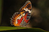
Alt text: Butterfly on a leaf
Keep it short
Generally, alt text should provide a concise description of the image. Screen reader users have to listen to a lot of copy being read in a synthesized voice, so brevity is a virtue. "Butterfly on a leaf," for example, would generally suffice for a butterfly image. Don't use "Image of butterfly on a leaf." That would be redundant. Screen readers recognize and announce images prior to reading the alt text. For the butterfly, the screen reader would intone something like "Graphic ... butterfly on a leaf."

Alt text: Iowa State University
Logos and other word art
Many graphics merely convey text. These graphics might include company names, logos or sections of text that have been turned into art. In such cases, the alt text is easy; simply restate the text included in the graphic.
Buttons and icons

Alt text: Next page
Alt text for icons and buttons should convey the button's function. So the alt text for a magnifying glass indicating a search would be "search" -- not "magifying glass." A right arrow linking to the next page should be labeled "next page" in the alt text, not "arrow."
When to leave the alt tag blank

Alt text should remain blank on decorative graphics
Decorative images, such as colorful lines, stars and swirls, are visual tidbits that may brighten up a website visually but add nothing to the content. Imagine a web page with lines of stars separating sections. It's very unlikely that screen reader users will appreciate hearing, "graphic, star," "graphic, star" repeated dozens of times. In such cases, make sure that alt text is empty, with no spaces between the quote markers (alt=""). The screen reader will ignore the art.
Related stories
- Accessible PowerPoints are on students' wishlist, March 30, 2017
- Captioning, with an assist from YouTube, Jan. 5, 2017
- Well formed forms, Oct. 20, 2016
- Links that do the job, Sept. 1, 2016
- Color your website accessible, July 21, 2016
- How to create accessible Word docs, June 23, 2016
- The art of alt text, June 9, 2016

